KH Webb Architects
Website Design and Logo RefreshOverview
KH Webb Architects designs multi-million dollar homes throughout the state of Colorado and across the world. In 2019, Principal Architect Kyle Webb received permission to showcase a premiere property his company had spent a decade building and designing for a single client. The property had recently listed for sale to the tune of $78 MM and Kyle was finally able to unveil his work.
Kyle asked us to rebrand his company and overhaul his website in response to the increasing public interest in his work. He gave us carte blanche to reimagine his site as not just an online portfolio, but an immersive experience.
When we set out to design the UI, our goal was to draw as much attention as possible to the stunning work. We went big - big with the imagery and big with the messaging – but were sparing and minimal with extraneous elements. This not only reinforced the minimalism of the brand, but kept the attention on the work. We also explored animation, but were careful not to make it a distraction like it so often is. Instead, we chose to keep the animation subtle, but interesting and unique.
The website was built in WordPress from the ground up using a fully customized theme. There are 16 content pages and 35 portfolio pages, and all content on the website is managed through built-in WordPress features and custom back-end modules.
The two pages below take a closer look at the thought that went into the design.
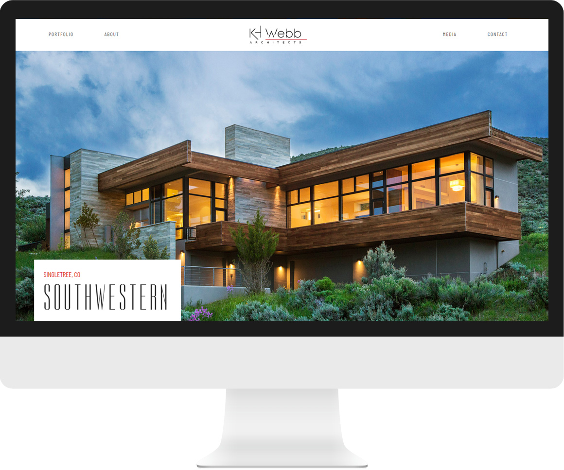
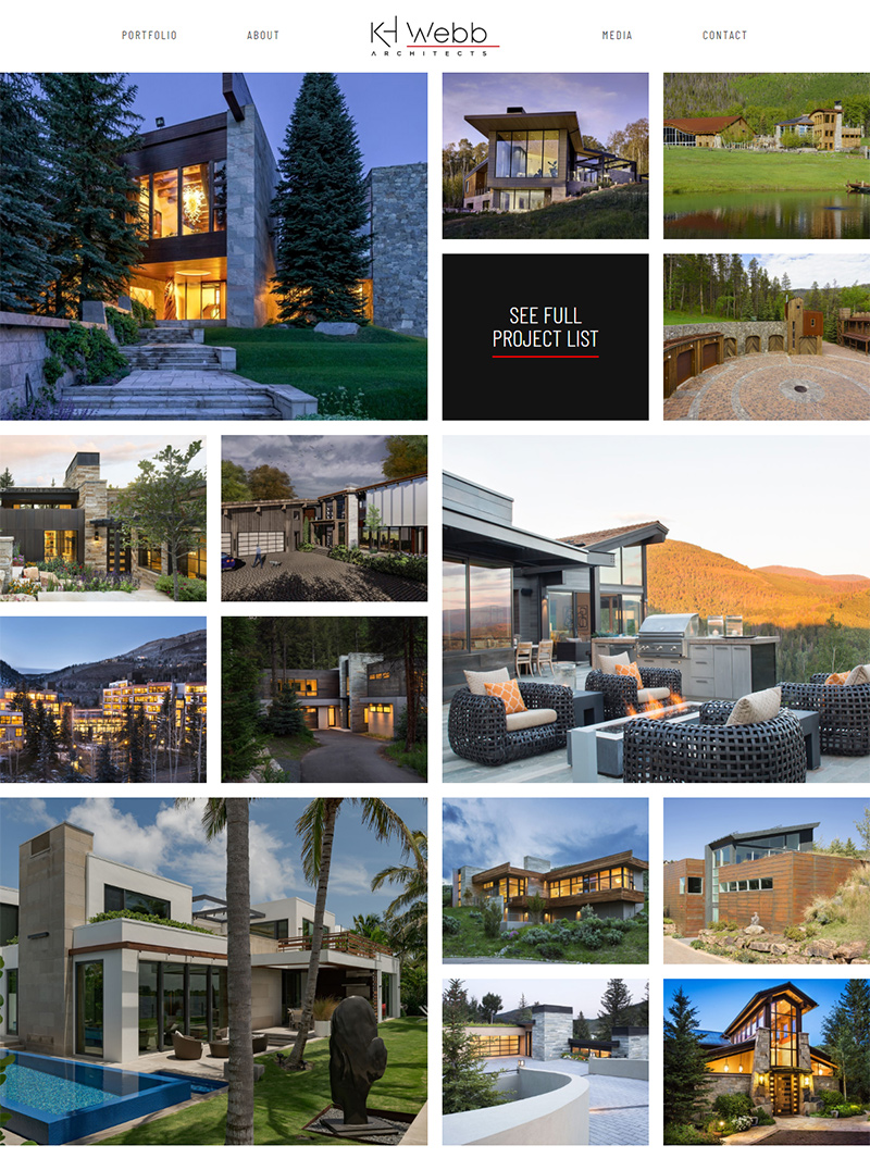
Portfolio Page
https://khwebb.com/portfolio/Layout
For the portfolio page, we developed our own version of a masonry format. Since there are regular projects and featured projects, we allocated significantly more real estate for featured project images. Projects are loaded dynamically, and the featured projects are staggered left/right for each row.
Back-End
On the back-end, we created an algorithm for ordering and displaying projects. After the projects are fetched from the database, the algorithm counts the number of featured and non-featured projects and determines the best way to format the last two rows such that there is the least amount of empty cells if there isn't a perfect number of projects to display.
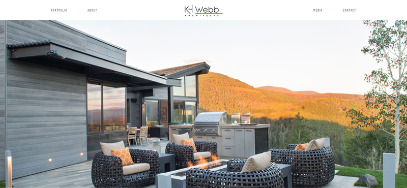
Project Page
https://khwebb.com/portfolio/mountain-star/Layout
Each project is customizable on the back-end. Rows can have a single image, a gallery, text and an image, or two images. We didn't want to limit the size of each image to the height of the page. Rather, we thought it would be more impactful to allow the user to scroll to see whole images. As a result, the user is able to fully appreciate the details in KH Webb's work.
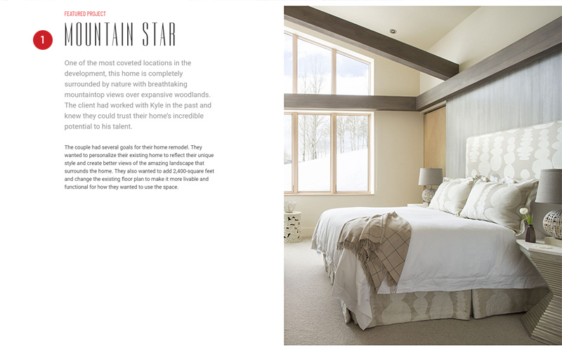
1. Project Intro
On large screens, when the intro text is relatively short and the accompanying image is relatively tall, the intro text will scroll with the page. That way, we don't end up with a bunch of white space on the left; also, it allows the user to read about the project while viewing the whole image on the right.
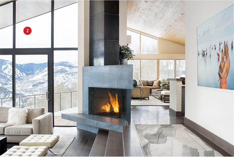
2. Gallery
Galleries display one image at a time. When rolling over the left or right portion of the image, the cursor becomes a left or right arrow respectively. Clicking on either portion will display the next image in the gallery.
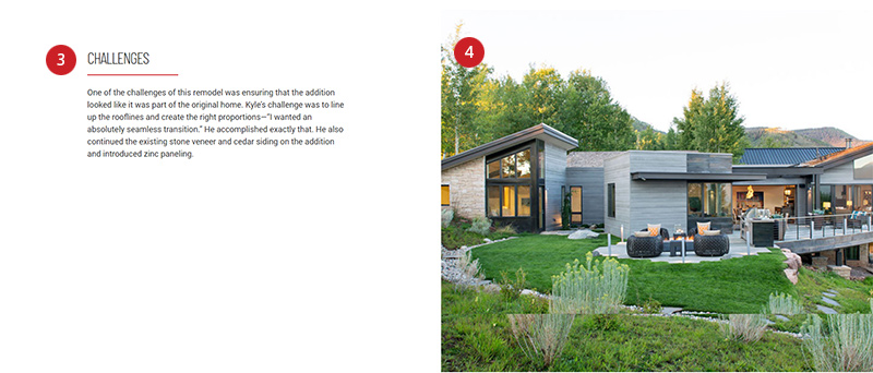
3. Section Headers
As the user scrolls, section headers display an animated red underline. This helps draw attention to the text of the page.
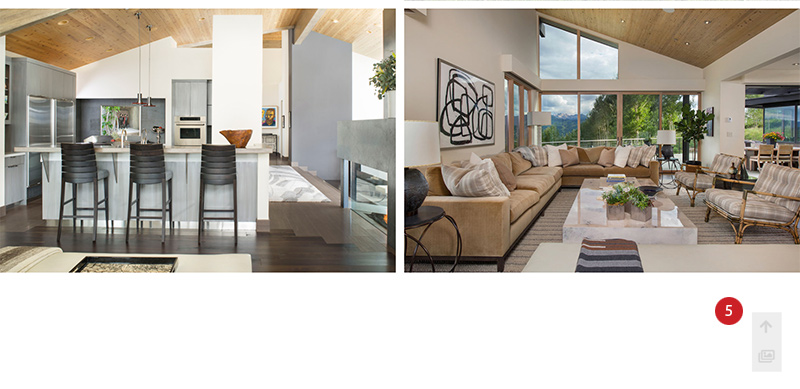
4. Image Pans
When images are added to the page on the back-end, a pan animation can be selected for each (up, down, left, right).
5. Controls
Each page has a fixed back-to-top button that appears when scrolling down. On project pages, there is also a gallery button. Clicking on the gallery button will display a lightbox gallery that includes all project images on the page.
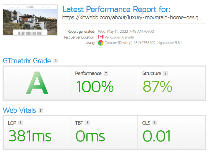
GT Metrix Speed Test
https://gtmetrix.comPerformance Grade: 100%
Structure Grade: 87%
Despite using lots of images and animation, the website passes all web vitals and has a high speed score.